Tutorial 5: The transient heterogeneous Neuman solution from 2004
We provide the transient pumping solution for the apparent transmissivity from Neuman 2004. This solution is build on the apparent transmissivity from Neuman 2004, which represents a mean drawdown in an ensemble of pumping tests in heterogeneous transmissivity fields following an exponential covariance.
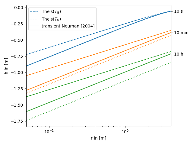
In the following this solution is compared to the standard theis solution for well flow. You can nicely see, that the extended solution represents a transition between the theis solutions for the well- and farfield-conductivity.
Reference: Neuman 2004
import numpy as np
from matplotlib import pyplot as plt
from anaflow import theis, neuman2004


time_labels = ["10 s", "10 min", "10 h"]
time = [10, 600, 36000]      # 10s, 10min, 10h
rad = np.geomspace(0.05, 4)  # radius from the pumping well in [0, 4]
var = 0.5                    # variance of the log-transmissivity
len_scale = 10.0             # correlation length of the log-transmissivity
TG = 1e-4                    # the geometric mean of the transmissivity
TH = TG*np.exp(-var/2.0)     # the harmonic mean of the transmissivity
S = 1e-4                     # storativity
rate = -1e-4                   # pumping rate

head_TG = theis(time, rad, S, TG, rate)
head_TH = theis(time, rad, S, TH, rate)
head_ef = neuman2004(
    time=time,
    rad=rad,
    trans_gmean=TG,
    var=var,
    len_scale=len_scale,
    storage=S,
    rate=rate,
)
time_ticks = []
for i, step in enumerate(time):
    label_TG = "Theis($T_G$)" if i == 0 else None
    label_TH = "Theis($T_H$)" if i == 0 else None
    label_ef = "transient Neuman [2004]" if i == 0 else None
    plt.plot(rad, head_TG[i], label=label_TG, color="C"+str(i), linestyle="--")
    plt.plot(rad, head_TH[i], label=label_TH, color="C"+str(i), linestyle=":")
    plt.plot(rad, head_ef[i], label=label_ef, color="C"+str(i))
    time_ticks.append(head_ef[i][-1])

plt.xscale("log")
plt.xlabel("r in [m]")
plt.ylabel("h in [m]")
plt.legend()
ylim = plt.gca().get_ylim()
plt.gca().set_xlim([rad[0], rad[-1]])
ax2 = plt.gca().twinx()
ax2.set_yticks(time_ticks)
ax2.set_yticklabels(time_labels)
ax2.set_ylim(ylim)
plt.tight_layout()
plt.show()